

Choosing a paint color feels simple until you are standing in the aisle holding forty swatches that all look almost the same. The truth is that the right color depends less on what is trendy and more on your home, your light, and the way you actually live in each room. That said, trends are a helpful starting point, because they tell you where designers and homeowners are leaning and which shades are easy to pair with furniture and finishes you can buy today.
As a family-owned painting company serving Worcester and the wider MetroWest and Worcester County area, we get asked about color more than almost anything else. So here is a practical look at where interior paint is heading for 2026, what tends to work well in New England colonials and capes, and how to choose a color you will still love a year from now.
Warm neutrals and greige are still leading the way
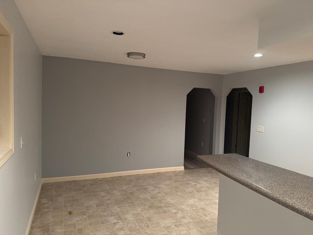
The biggest direction for 2026 is warmth. Cool grays that felt fresh a decade ago are giving way to softer, warmer neutrals: creamy off-whites, oatmeal, mushroom, and greige, which is a blend of gray and beige that reads as calm rather than cold. These colors are popular because they are forgiving. They flatter wood floors, they pair with almost any furniture, and they shift gently through the day as the light changes.
In New England homes, warm neutrals do real work. Older colonials and capes often have smaller windows and deep-set rooms, so a warm base color keeps a space from feeling gray or dreary on an overcast winter afternoon. If you want a whole-home palette that flows from room to room without looking flat, a warm neutral is usually the safest and most livable place to start.
Soft earthy greens and sage bring nature indoors
Green continues to be one of the most requested colors, and for 2026 it is trending toward the soft, earthy, and muted end of the range. Think sage, olive, and grayed-out greens that feel grounded rather than bright. These tones lean into the nature-inspired mood that keeps growing in popularity, and they bring a sense of calm that works beautifully in bedrooms, offices, and kitchens.
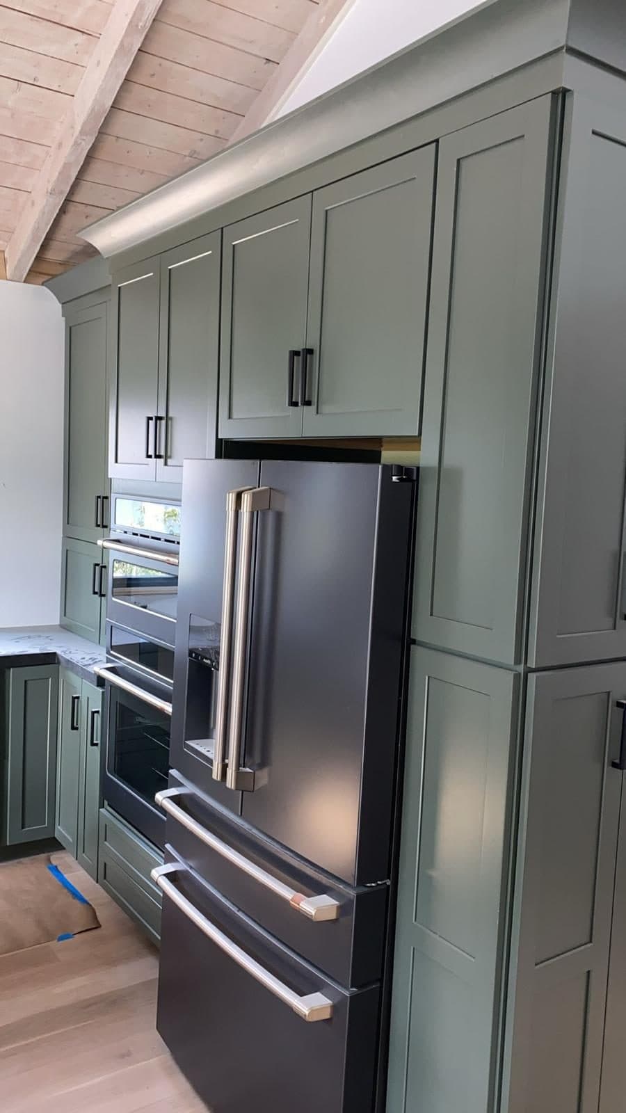
Sage is especially at home in this region. New England is surrounded by woods and changing seasons, so a muted green picks up on what is already outside the window. We see homeowners in Shrewsbury and Westborough using sage on kitchen cabinets, mudrooms, and accent walls, where it pairs naturally with warm woods, brass or matte black hardware, and creamy trim.
Moody blues for depth and character
If warm neutrals are the easy choice, moody blues are the confident one. Deep navy, slate, and softened denim blues are trending for rooms where you want drama and coziness at the same time. They work well in dining rooms, home offices, powder rooms, and built-in bookcases, where a richer color adds depth without overwhelming the whole house.
Blues suit the classic New England look almost effortlessly. A deep blue on a colonial dining room or on cabinetry reads as timeless rather than trendy, and it plays nicely with the crisp white trim these homes are known for. Because darker colors can feel heavier in low light, they usually shine best in rooms that get decent daylight or that you want to feel intentionally intimate in the evening.
Warm whites for trim, ceilings, and bright rooms
White is not going anywhere, but the version that feels current for 2026 is warmer and softer. Bright, stark whites are giving way to warm whites with a subtle cream or greige undertone. These shades keep trim, doors, and ceilings looking clean and crisp without the cold, clinical feeling that a pure white can create, especially under New England's gray winter light.
A warm white trim also acts like a frame. It sharpens the look of a sage green wall, makes a warm neutral feel intentional, and gives moody blues a crisp edge. If you are repainting a whole room, matching the right white to your wall color matters just as much as the wall color itself, and it is one of the details that separates a professional result from a rushed one.
How to choose colors by room and light exposure
The direction a room faces changes how a color looks, so it pays to think about light before you commit. North-facing rooms get cooler, softer light and can make cool colors look flat, so warm neutrals and soft greens tend to feel better there. South-facing rooms get strong, warm light for much of the day, which lets you play with deeper or cooler shades without the space feeling gloomy. East-facing rooms are bright in the morning, and west-facing rooms warm up in the afternoon, so watch how a color shifts across the day.
Room function matters too. Bedrooms and offices often benefit from calming, muted tones that help you relax or focus, while kitchens and living rooms can handle a little more warmth or depth because you spend active hours there. A good rule of thumb: pick your mood first, then choose the specific shade that delivers that mood in your actual light.
Test samples, pair your trim, and use accent walls wisely
Never trust a color chip alone. Paint large sample patches on more than one wall, and look at them in the morning, at midday, and at night, and on both a sunny and a cloudy day. A color that looks perfect in the store can turn green, pink, or gray once it is on your wall next to your floors and furniture, and New England light changes dramatically with the seasons.
When you land on a wall color, choose your trim white and any accent color at the same time so they read as a set. Accent walls can be a great way to add a moody blue or a deeper green without committing a whole room, but they work best when the wall has a natural focal point, such as a fireplace, a bed, or a set of built-ins. Used thoughtfully, one bolder wall gives a room character while the rest of the space stays calm and easy to live with.
Where George's Painting fits in
We paint interiors across Worcester County and MetroWest, and color is one of the parts we enjoy most. George's Painting uses Benjamin Moore paints, which give you an enormous color range and reliable, consistent results across coats and finishes, so the shade you approve on the wall is the shade you get when the job is done.
Picking a color you will love for years is easier with a second set of eyes. We are happy to talk through your palette, help you compare a few finalists in your own light, and recommend the right sheen for each room. Whether you are updating one room or repainting your whole home in Worcester, Northborough, or Grafton, we are fully insured, and we offer free estimates so you can plan the project with real numbers before you commit.